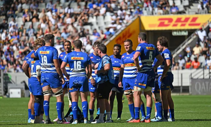
The Stormers will no longer have their iconic logo on the heart of the jersey as the team embraces change with a brand new logo ahead of the start of the new URC season.
Image: BackpagePix
Stormers Rugby stepped into a bold new era on Wednesday as they revealed a changed logo for the side ahead of the 2025/26 rugby season, stating that an upgrade was long overdue.
While the change is set to meet resistance from parts of their supporters’ base, the decision-makers of the company, the Red Disa Group, feel the time for change is right since they have taken over.
After rescuing the Stormers from bankruptcy, after which the side captured the inaugural United Rugby Championship title (URC) against expectations, the next step for the Cape side was to continue with progress off the field.
For over 25 years, the Stormers’ previous logo, featuring a lightning bolt through the S, served the side, only slightly changing in appearance since the dawn of the team in Super Rugby. However, the logo revamp is set to take the team and business in a new direction as they look towards further success on the European rugby landscape.
The Stormers will face Leinster next month in the opener of the URC in Cape Town, and the hosts are set to don their new logo on the chest for the first time, as well as the latest kit by Adidas, which looks set to rejoin the Cape outfit ahead of the new season.
The decision to rebrand was not taken lightly by the owners, and they consulted with various role-players, including the players and fans.
According to a Stormers release, the logo features the iconic hoops of the Stormers jersey wrapping around and interlocking in a striking design that gives a nod to the heritage of the team, while also showing constant movement as the Stormers head towards an even brighter future.
“The hoops connect with a subtle lightning bolt in the centre, while the shape of the logo itself invokes the dimensions of the team’s home ground – DHL Stadium in Cape Town. The new era is framed by the mantra that we are all ‘In it together’.”
Johan le Roux, CEO of Stormers Rugby, expressed the necessity for this evolution, stressing that the updated identity aligns with the club's ambitions.
“We have seen some major developments in the way we operate and where we see ourselves going as a club. This felt like the right time to update our identity as we embrace a new era, with all of our stakeholders ‘In it together’ with us.
“The previous logo was over 25 years old and past due for an upgrade. This new logo holds far more symbolism, with the hoops of the jersey making up an icon that represents the unity of the various communities that support our team. It's not just about the logo. It's a representation of how we connect with our fans, and we want them alongside us as we break new ground together.”
John Dobson, director of rugby, echoed Le Roux’s sentiments, emphasising the pivotal role the passionate fan base plays in the success of the Stormers.
He considers this fresh identity as a significant evolution in the club’s narrative.
“We aim to transform our reach from being simply a rugby team to becoming so much more. Our supporters are at the heart of this journey, and the new branding reflects our shared aspirations.”